Wednesday, 6 May 2015

Can I out-predict a bunch of yahoos with statistics? NHL Playoff Edition (Update 1)

Forecasting is hard. If I could do it well I wouldn't be picking an NHL fantasy team. I would be picking stocks. And I would be swanning around on my yacht in the mediterranean. With that excuse in mind how are things going in the play-off pool.

After the first round of play-offs I've come out ahead of the pack but nowhere near first place. That honour goes to team Rye followed by team Disaronno. I follow in a close third, ten points back from the front.


--------------------------------------
  rank |     Team         Points
----------+---------------------------
        1 |          Rye            51
        2 |    Disaronno            43
        3 |      Strobes            41
        4 |          Rum            38
        5 |      Everglo            37
        6 |    Moonshine            35
        7 |     Absinthe            34
        8 | Jack Daniels            33
        9 | Jagermeister            31
       10 |         Beer            29
       11 |       Brandy            28
       12 |          Gin            27
--------------------------------------


But as Henry Jones Sr. would say "thersh no shilver medal for finishing shecond". I either place first or I lose. So based upon how things have been going so far how am I projected to finish? This would be the time for any Jets HR people to send me that contract and not finish reading this blog. 

Turns out not well. I project forward how I expect points will evolve based upon a couple key pieces of information. First, half of all teams are eliminated from the playoffs each round. This reduces the number of players in the pool by roughly half each round that we go through. It also means that on average each person in the pool should see their points per round half each successive round. This is a basic geometric growth process that you might have seen in grade 11 math and it should be a fairly reasonable way to project forward how many points each fantasy team should get based on information from the first round.

In addition to this we also know which NHL players continue to be in the pool and which ones have exited. Even if a fantasy team continues to have ten of their players, if they're not particularly productive then it really doesn't matter that a majority of the fantasy team has not yet been eliminated. Conversely, if someone has only a few very productive players they might be able to milk a whole lot of points out of them even though their fantasy team has been eliminated. Team Rye finds themselves in this latter situation where they only have four players after the first round but they're unfortunately very productive players. 

So this next assumption that I make is that, for the second round, each team will get the same amount of points that they got in the first round, minus the points of the players that were eliminated in the first round. This amount then halves for each additional round. In math terms it looks like this:


Total projected points are equal to the already earned points in the first round, Xp, plus the projected points from the remaining rounds. Xp-n is a term for all of the points earned by players in the first round who were eliminated and therefore cannot earn any more points. Taking into account that half of all NHL players will be eliminated, the difference is then divided by a geometric factor as the rounds of play-offs progress.

This is how everyones points are projected to evolve.


And this is the final rank estimation based upon this projection.

------------------------
Rank  |     Team
----------+-------------
        1 |    Disaronno
        2 |          Rye
        3 | Jack Daniels
        4 |          Gin
        5 |      Everglo
        6 |      Strobes
        7 | Jagermeister
        8 |          Rum
        9 |         Beer
       10 |     Absinthe
       11 |    Moonshine
       12 |       Brandy
------------------------


This bodes poorly for my fantasy NHL team. So what went wrong here? In looking back at the regression results from my original model a couple of things leap out. First, the model put a big emphasis on goaltending. The model estimated a large coefficient for the save percentage term but it didn't do it very precisely. This is the root cause of the model predicting Montreal to do well. It overemphasized the great season that Carey Price had. On the back of this I picked two Montreal players. The remaining variables are also not all that precisely estimated which should induce a lot of uncertainty in the predictions.

The second thing that went wrong was idiot human error in the form of my own stupid picks. Despite saying that I would only pick players from teams that had a good chance of advancing in a series I picked two players from Nashville. I probably should have avoided the Nashville - Chicago series where the betting markets basically predicted a toss-up. 

But all is not lost. As of writing this I am in decent position with a ten point gap between me and the next fantasy team. I've kept pace with teams Rye and Disaronno. There are a couple of reassuring reasons why these projections might be wrong. First, I bet the heaviest on Anaheim by picking up three of their players. They then proceeded to destroy Winnipeg in very short order (don't deny it, it happened) but that meant that the series only went four games. Fantasy teams including team Disarrono bet heavily on Chicago where the series went to seven games and his players had three additional games to get points. The Minnesota - Chicago series does not look like it is going seven games. Besides this, team Rye has three of his remaining players on Minnesota and team Disarrono has five players on Chicago. One of them is very screwed after this round. 

Sunday, 3 May 2015

How many doctors become disabled?

Irrelevant statistic to this post: I watched the Pacquio-Mayweather fight last night and my favourite statistic was that the total take from the fight was greater than the gross national incomes of the 29 poorest nations.

As medical school winds down several things occur. The snow starts to melt. The rotations on various medical services become devoid of fourth years. Medical students become lazy and relaxed before the long slog of residency starts. And companies looking to vampire as much money out of a group of future one percenters scuttle out of the woodwork looking for a piece of the financial action. 

Over the last couple of weeks my classmates and I have been subjected to a parade of slick, bespoke suit wearing, banker types who all gave presentations on how much money we were all eventually going to make. The bankers gave pitches that were all subtle variations on "you're all going to be stinking rich. Now let me take some of that money and make you even more stinking rich and myself stinking rich too!" And people wonder why medical students get such big egos. On top of that, every one of them brought us a "free lunch" to go with the presentation. I technically have two degrees on the topic of free lunches so I put that phrase in quotes for a reason. 

A lot of the pitches were on the importance of navigating tax loopholes. Essentially you pay these guys so that you don't have to pay the government even more. But in addition to this, almost all of them pitched disability insurance to us. The line was that the greatest earning potential was "in our brains" and that we should "protect it" by insuring it.  Almost invariably, at some point during the pitch there was a story about some doctor who had got their hands chopped off in a random golfing/boating/gambling accident and who had filed for disability insurance the week before but the paperwork hadn't gone through yet and if only he had purchased disability insurance sooner! Now his kids hated him and his wife divorced him and he was an alcoholic all because he didn't have disability insurance. 

Disability insurance has been pitched to me more than a couple of times during medical school, which automatically makes me sceptical of it. Every time some finance guy tells me about disability insurance, I get the feeling that he's looking at me as though I was transforming into a giant sack of money with a dollar bill on the front of it. Given that so many people want to sell medical students disability insurance, it must be a fairly lucrative field. Most medical students are young and don't have a lot of risks to become disabled in the next couple of years. I would also have thought that doctors in general have a pretty low risk of becoming disabled given the income they make and the lifestyles they lead. None of these bankers have ever given me any actuarial odds on how likely it was for me to become disabled at any point. They just told me the anecdote about the pathetic doctor without disability insurance. If doctors were getting their hands chopped off left and right, the bankers would have pitched disability insurance that way.  Let's see if this actually stands up to statistical evidence.

Now a couple of things before I go into methodology here. First, I'm flattered that some people have mistaken my economics degrees as evidence that I have any real knowledge about how insurance works. The type of insurance that I learned about was more like this (scroll down to the appendix). Try applying any of this to real life. But there are two broad principles that leap out of insurance theory in economics. First, purchasing insurance is related to risk. What is the true risk of becoming disabled? This is really the focus of this post. 

Second, purchasing insurance is related to how unhappy you are at accepting a certain level of risk. How risk averse are you and what do you have to lose if you don't purchase insurance? Most people are in some way risk averse but some are more so than others. I don't have any kids (that the legal system acknowledges), but if I did I would be a lot more worried about becoming disabled even if my true risk of becoming disabled was the same. Similarly, I'm a pretty relaxed guy but if I was an uptight worrier I might consider getting disability insurance to give myself "peace of mind". 

I can give you something of an answer on the first reason to purchase insurance, but the second reason is all up to you. So you are to take none of what follows as sound financial advice. This is not "actionable" as my lawyers would say. It's up to you to decide whether you should get disability insurance. 

So at what risk are you, fellow medical student, of becoming disabled during your career? It's actually much more difficult to answer this question because the public use labour force surveys don't identify doctors in the workforce. There are so few doctors that if you actually noted them in the national data you could start to pick out individuals with a couple of other key variables. To avoid this they don't identify doctors but they do identify people working in certain fields and in certain professions. They identify people with certain degrees. So for what follows, I haven't actually been able to identify any doctors but I have identified people who according to the data look very much like doctors. These are people with graduate degrees, who work in the health sector, and who are professionals in the health sector. This group of people does not include nurses, but it probably includes people who are pharmacists, dentists, chiropractors, physiotherapists, and other professional health care workers. I will be denoting this group with the abbreviation "PWLLD" (people who look like doctors).

This data is taken from the 2013 cross-sectional Labour Force Survey (LFS). The LFS is a monthly survey that evaluates trends in Canadian labour force participation and employment. It also identifies whether someone is unemployed or underemployed because of a personal disability or illness. This data is re-weighted using a frequency weight to provide nationally representative results.

The one major problem with my strategy here is that because I cannot identify doctors directly, this will necessarily include chiropractors or dentists or other such people who may be different in their respective probabilities of becoming disabled. I think the true probability of disability will be close to this, but there will most certainly be some error in this estimate.

I look at two major outcomes. First, what is the probability of being disabled or ill to the point where one has to work part time? Second, what is the probability of being so badly disabled or ill that one cannot work?

So what is the probability in this group of people who look like doctors of becoming disabled so they can only work part time? The following pie charts are estimated percentages of people who are in the labour force and their reasons for working part time. The chance that someone in the PWLLD group has to take part-time work because of a disability or illness is about half a percent. PWLLD do actually become disabled at a higher rate than the general population but it's not really that much higher. A full 83 percent of PWLLD are either not underemployed or consider themselves outside of the labour force (the "not applicable" category). Interestingly, PWLLD tend to work part time because of personal preference more so than the general labour force. An additional 5% of the PWLLD take time off as a personal preference and this fully accounts for the difference between the two groups in the "not applicable" category. They also tend to work part time more than the general population in order to care for their children. High salaries among the PWLLD may be the reason that these people can take part time work for personal preference or to take care of children.

Reason for working part time - People who look like doctors

Reason for working part time - General labour force

PWLLD do much better than the general population when it comes to job-ending illnesses or disabilities. Less than .02% of PWLLD get a job-ending disability or illness. The general population gets a job-ending disability or illness about 20 times this rate.

Reason for being unemployed- People who look like doctors 
Reason for being unemployed - General labour force

My suspicions about the age of onset of a disability or illness for PWLLD are also confirmed. Of the PWLLD who get a work-limiting disability or illness and who have to work part time, about 90% occur after the age of 50. About 98% occur after the age of 40 (the red line represents PWLLD, the blue line represents all people with graduate degrees, and the green line represents the general population). I looked at job-ending illnesses and disabilities as well, but because there are so few PWLLD who get job-ending illnesses or disabilities, it's not really informative.

What age do people get disabilities/illnesses causing part-time work? Red line is PWLLD, Blue line is people with graduate degrees, green line is the general population.

So the reason why I think all of these financial companies are trying to sell medical students on disability insurance is two-fold. First, it's free money for the first ten to fifteen years of a doctor's life. The likelihood that an insurance company is going to pay out to any doctor is already low, and the chance it'll have to pay out to a 30 year-old doctor is exceedingly low. Second, it's a way for a company to worm its way into future doctors' financial affairs and reel them in for more lucrative financial services down the road. So I probably won't buy disability insurance just yet.

But if I ever get my hands chopped off in a random golfing/boating/gambling accident, I'm really going to be eating my words. 


Friday, 17 April 2015

Can I out-predict a bunch of yahoos with statistics? NHL Playoff Edition

The answer is probably not. More on that later.

There comes a time in every male data analysts life where their testosterone builds to frightening levels and they have to apply their skills to over-analyze sports. For me, today is that day. The NHL playoffs began last night and for a Canadian econometrician who is male (most of them are) the playoffs are like Christmas to a kid or new-trailer-release day to a Star Wars fan. There's data and probability and forecasting a plenty. If you've heard of a statistics term it can probably be applied in some way to sports. 

More importantly, econometric forecasting in the playoffs can be used to make money and even more importantly to take other peoples money away from them. And really, what else is there to life other than getting obscenely wealthy at someone else's expense? So at the last minute I managed to finagle my way into a group of guys who were in a pool for the playoffs. The buy-in was $20. Each guy drafted twelve NHL players and whoever gets the most aggregate points (ie. goals and assists for all of their players) wins the pot. Second place gets their money back. 

I signed up for this draft on Monday afternoon and the draft itself was at 8PM that night. I dropped everything and rushed home to run regressions with great abandon. What follows is a sketch of my process and playoff drafting rules of thumb but I did this all in about three hours and so there is probably going to be some major problems with them.  I didn't look at the current hockey forecasting literature, I didn't use any fancy stats, I didn't backtest the statistical model. I cut corners all over the place.

Now that I've effectively exonerated myself in case my team sucks, lets talk about what I did. The basis for my draft is a statistical model that predicted how many points a player will get dependent upon several factors. Its a multivariate ordinary least squares model that uses player and team data from Hockey-Reference.com for the years of 2012 to 2015. In addition, I pulled one other variable from a Las Vegas betting website on historical team odds for winning the Stanley Cup. 

The general way I predicted how many points a player would get was to use variables from the regular season in my regression to see how well they predicted play-off performance in that year. The model would spit out an estimate for how much each variable predicted play-off point performance for the years of 2012-2014. I then used these coefficients to predict how players would do in the 2015 post-season using regular season data from 2015. This was the easiest way to make any predictions for this year as (obviously) we only have regular season statistics for 2015. I realize that previous play-off performance for each player would be useful but again, I was under the gun to get this done and I didn't have time. 

Onto model selection. When I was thinking about what would accurately predict how a player would do I basically classified the variables into three major categories. First, is the individual players skill. Sidney Crosby is likely going to get a fair amount of points because he's not the average NHL hockey player. He's a superstar and, like many other superstar players, skill likely plays a large role in the play-offs even if your team is bad and you aren't expected to go far. A guy who gets 10 points in the first round but who gets eliminated from the play-offs is probably not a bad pick depending on when you get him. So for individual skill I used regular season points and time on ice. I've also included dummy variables for what position the player plays (ie. LW vs. RW vs. C vs. D)

The second group of variables that I included were team related variables. Sidney Crosby is also on a team with a number of very good players who can score and pass him the puck so he can score. A player's team is also important for how deep your drafted players will go in a play-off run. A team that can go deep into the play-offs will likely have more chances to get more points for their players. I assumed that these factors were in some way predicted by team offense and defense statistics. For these variables I've included number of regular season wins, goals for, goals against and average save percentage of the teams goalie for the team each player is on. 

The final group of variables that I wanted to include were related to opponents that a team would be facing. Sidney Crosby and his band of merry hockey players are very good but they're also playing the Rangers who have been to the finals last year and who have had a very good regular season track record. This means that even though the Penguins are good they might not go very far. To control for this I added the Las Vegas betting odds that a team would win the Stanley Cup. Not only should the betting markets build into their price that a team is skilled and has a shot at winning the cup (which I've already attempted to control for with the second group of variables) but it should incorporate information on the opposition that they face in reaching the Stanley Cup.

In mathematical terms the model is basically this:


Post-season points for player i in year y are a function of all of the variables that I outlined above as well as an error term that is distributed iid. The betas are estimated using 2012 to 2014 data and then they are incorporated into an equation that uses 2015 data to predict a players 2015 post-season point totals.

Regression results here:

      Source |       SS       df       MS              Number of obs =     648
-------------+------------------------------           F( 10,   637) =   30.18
       Model |   4028.8757    10   402.88757           Prob > F      =  0.0000
    Residual |  8504.40208   637  13.3507097           R-squared     =  0.3215
-------------+------------------------------           Adj R-squared =  0.3108
       Total |  12533.2778   647  19.3713721           Root MSE      =  3.6539

------------------------------------------------------------------------------
     playpts |      Coef.   Std. Err.      t    P>|t|     [95% Conf. Interval]
-------------+----------------------------------------------------------------
         pts |   .1181479   .0140399     8.42   0.000     .0905777     .145718
             |
     poscode |
          D  |  -.6354497   .4383468    -1.45   0.148    -1.496229    .2253298
         LW  |   .0316336   .4398774     0.07   0.943    -.8321514    .8954186
         RW  |  -.4466971   .4306716    -1.04   0.300    -1.292405    .3990106
             |
         toi |   .0006188   .0005999     1.03   0.303    -.0005592    .0017969
           w |   .0261791   .0601923     0.43   0.664    -.0920203    .1443784
          gf |  -.0043203   .0164696    -0.26   0.793    -.0366616     .028021
          ga |  -.0147689   .0120157    -1.23   0.219    -.0383641    .0088262
       svper |    73.9586   23.63515     3.13   0.002     27.54636    120.3708
        odds |  -.0322589   .0166924    -1.93   0.054    -.0650378    .0005199
       _cons |  -64.19289   21.57956    -2.97   0.003    -106.5686   -21.81722
------------------------------------------------------------------------------


The predictive model kicks out this list of players in ranked order from most expected points to least expected points. This was the backbone for how I chose my twelve players. A couple of things about this list. First, the top twenty or thirty players on this list kind of make sense. This is reassuring that the model is making semi-decent picks. But anyone can pick a lot of these players off of a list of top performers in the playoffs. The real utility in the model will be in the middle picks (a Lars Eller or Brent Seabrook type pick) where it might take a more discerning choice to make or break a fantasy hockey team. Theres a total of 144 players that were picked by the pool so not all of them can be a Sidney Crosby or a Steven Stamkos where point production is assured.

Second, this model was not designed to pick a Stanley Cup winner but it does show some interesting things at the team level. If you graph the average rank of the players on the list by team (which in turn should rank the average number of points that each team should expect per player) this bar chart pops out. This shows that Montreal players have the highest average predicted points among all teams in the playoffs this year. The next tier of teams is St. Louis, NYR, Anaheim and Nashville. I would expect these five teams to be the favourites for the cup. At the other end are Calgary, Ottawa, and Winnipeg. Now this does not mean that these teams won't advance. I can think of scenarios where all the games they play are defensive battles without a lot of scoring. But especially since the model predicts high point totals from Montreal and Anaheim I would expect both Winnipeg and Ottawa to be out fairly soon. That being said, it's the playoffs and anything can happen. Also my model might be awful. Don't send me hate mail Winnipeg.


So this ranking list was the basic tool I used to make draft picks but in addition to this I also used two heuristics that I stole from finance. Full disclosure, I have never taken a real finance course in my life but I have taken a couple of macroeconomics courses and a financial risk analysis course (which was basically a primer on how not to tank the macroeconomy). I did however learn three things about finance from these courses. First, finance is so boring that you have to pay people a truck load of money to get them to do it. This is the least applicable lesson to this blog post (but maybe the most applicable lesson to life in general). Second, groups of people usually make more accurate decisions than individuals (a weak version of the efficient market hypothesis). Third, diversify, diversify, diversify. I use the analogy of a stock portfolio here because it's relevant. If you only invest in one stock, as opposed to several, you are likely to have returns that are highly volatile. They may be very high but they also may be very low. Similarly, if you pick players from one team, the team may go far but it may also flame out in the first round. Diversifying picks, just like stocks, is the least risky strategy.

These later two lessons are the basis for my heuristics. First, where the list identified two players who had similar predicted points I picked the player on a team that had better odds of progressing past the first round. This was according to the betting odds that I got from the Las Vegas bookie website.

Second, where I had two similar players, I would pick a player who was not on a team of a player that I had already drafted. In essence I made sure that I didn't have more than three players from the same team. This was to avoid tanking my team in one fell swoop if an NHL team with a whole bunch of my players exited the playoffs.

This resulted in the list of drafted players here. Its a solid list and includes three out of the top five ranked players and five out of the top 15. It did however, suggest some weird players like Mike Ribeiro.

It was interesting to watch the other members of the pool pick players because it was clear that most of them were also following their own little rules of thumb. Most of them followed a similar heuristic to my first, i.e. pick the players on the consensus favourite teams. This has the obvious benefit of allowing your players to go deep and will likely get you more points.

The heuristic that they didn't follow though was my second one. Most of them picked a team they liked and thought would go far and loaded up on players from that team. Eight of the twelve members have at least 50% of their players on two NHL teams. This is a high risk, high reward strategy, and it's probably the reason why I won't win the overall pool. Out of the group of yahoos, on average one of them is going to pick the Stanley cup winning team. Their players will go far in the playoffs and earn a lot of points. The rest will flame out in spectacular fashion once their team of choice gets knocked out of the playoffs.

For what its worth though here is the average rank of the players on each team by predicted points. To protect identities (and in honour of Alcohol Awareness month) I have coded the names of the pool members except for me.


If you believe my little model then I'm ahead both on the average rank of player chosen and the predicted number of points. But not by that much in the case of team Rum and team Rye. Interestingly (although I'm not sure if this was their strategy) team Rye and team Absinthe also diversified their picks as much as I did.

So I'll try and give updates on the pool rankings over the four rounds of play-offs not only to see how the model is doing but to publicly brag or mourn depending on results.

Also if the Jets want to give me a sweet seven figure salary, shoot me a message and I can tell you guys how badly you'll lose in a private venue.


Tuesday, 14 April 2015

Where is the most desirable place to do a medical residency?

This may seem like a trivial anecdote but it is one of my favourite examples of competitive forces at work. The University of Manitoba - Bannatyne campus is essentially the medical arm of the University of Manitoba. It's separate from the main campus and attached to the Health Sciences Centre which is the main hospital complex in Manitoba. Unfortunately because of contracts signed by the University of Manitoba all food services at the Bannatyne campus including coffee are provided by a certain soulless catering conglomerate. Now, I'm not entirely against greedy evil corporations like this one. They have a job to do which is to make money. But this company had a monopoly on all food services on campus which meant that you either ate their food and drank their coffee or shut up. They didn't have to compete and this made for poor service.

I remember in first and second year waiting in line at the campus Tim Horton's run by this multinational tool of a company. The line was never that long but they still took ages to get through. Once you got to the counter you were met by a coffee person (does barista apply at Tim Horton's?) with a glum look on their face who would brusquely take your order and shove a cup of hot coffee in your hands. The major kicker to all this was that, despite working in a building where you could literally take a picture of inside a persons brain, this Tim Horton's was a cash only affair. No debit or credit accepted. As a disorganized medical student who would regularly forget what day of the week it was, going to the bank for cash was way to advanced for me. So I would usually trudge by the Tim Horton's on the way to class disgruntled and coffee-less which was only slightly worse than standing in line for 20 minutes seething about the poor service.

Then, in second year, a hotel for families of patients opened up on the Health Sciences campus and inside that hotel was a Starbucks. This Starbucks, like any modern self-respecting business, had the ability to accept credit and debit purchases and so I began to spend all my money on Starbucks never to return to the Tim Horton's again except in desperation. But whenever I did go back I noticed, at least anecdotally, that the service was faster (if not nicer) and more importantly they had installed a debit machine. Moreover, the same company later set up their own Starbucks kiosk (with a debit machine) right across from the Tim Horton's in an attempt to capture some of the people who were buying coffee from the renegade hotel Starbucks.

This may seem like a small victory but its an important example of how competition works to make people better off. The hotel Starbucks forced the evil catering monopoly to change their business practices to make Tim Horton's more convenient for their customers. No longer did I or my disorganized cashless compatriots have to sit in a lecture without caffeine. We could get it whenever we wanted on demand.

This idea of voting with ones feet is an important part of competitive forces. People went to Starbucks instead of Tim Horton's and this forced them to change. But in a static sense competition also reveals desirability. Starbucks got more business than Tim Horton's because it provided a more desirable product.

This same idea can be used to (roughly) measure what university residency programs are the most desirable. Universities that are desirable should attract medical students to them and undesirable universities should drive medical students away. Medical students, like coffee customers, should vote with their feet. This seems simple in theory but its actually much harder to discern desirability in the residency match than in my coffee example. The problem with residency is that the number of spots that each program has are limited. At Starbucks you can line up out the door - theres no cap on demand. At a medical residency program though there are only so many spots and if you don't get one then, tough luck buddy, hit the bricks.

Because of this there are really two ways to get into a desirable residency. The first is to be a savant. On average desirable universities will have higher quality applicants and these applicants will get in ahead of their peers. The second way to get into a desirable program is luck. Village idiots get into desirable programs because all the stars align and they manage to fool their residency interviewers. This luck is helped when there are many of them. Like a swarm of mosquitoes, you can swat most of them down but, just on sheer numbers, one is going to get by you. 

So desirable universities should see high volumes of applications (the village idiot effect) from medical students at other schools and they should see high quality applicants (the savant effect) from other schools. Both will combine to result in a high number of medical students from other universities getting into desirable universities.

Besides this though a truly desirable program should be widely desired. If Manitoba is a desirable place to go for residency (this is obviously an example) there should be a high percentage of med students from UBC and McGill and Toronto and Calgary etc. who all get into the University of Manitoba. It shouldn't just be that all of the outside students are from Saskatchewan. Less desirable schools may see high numbers of med students from nearby schools come to them because of geography or whatever but they won't see large numbers or medical students from distant schools. Their popularity won't be wide spread. 

So the metric I use to gauge desirability is the average percentage of each medical school class that goes to do a residency at a particular university. This does not include those medical students that stay at their home school. So this metric for desirability at university x is then


where r is the number of incoming residents who go to university x for residency from university i, m is the number of medical students in each graduating class, and j is the number of medical schools. This is just a fancy way of saying the average percent of all other medical classes that go to university x is the proxy that I use for desirability.

For this, I took data for this from the Canadian Residency matching service website (CARMS) from their published match reports.  Although CARMS publishes a report every year most of their data is not in user friendly form and I was lazy. I only examine two years of data - 2004 and 2014. 

Below is the ranking for 2014. This shows that on average, medical schools (excluding the University of Toronto) saw about 9% of their class go to the University of Toronto for residency. This places UofT as top school by this metric. Conversely, just under 1% of any given medical school class (excluding Saskatchewan) went to the University of Saskatchewan for residency.


In everything thats preceded this, I deliberately avoided defining what a desirable residency program is to avoid speculation about what desirable attributes are. There are a lot of individual decisions that medical students make when they choose a residency program. But you can pick out at least partly why some of these places are low on the rankings and some are high on the rankings. The bottom four schools including my own soon-to-be alma mater are in "undesirable" locations.  The top five on the other hand are in "nice" cities or near nice cities (I'm looking at you McMaster). These top five universities also have anecdotal reputations for being good teaching programs which probably drives desirability as well. On thing I am surprised about is that Calgary isn't higher. It has a reputation for being a difficult place to get a residency position but this may just be a sign that this metric isn't that good of an indicator for desirability.

Universities in Quebec are also fairly far down the rankings. I suspect this is for two major reasons. First, you not only have to speak French in these residency programs but medical French. Medical school is basically a four year language program in latin sounding medical terminology so to do this all over again in a different language is probably not enticing for english speaking medical students. Second, pay for residents in Quebec is the lowest in the country. By quite a bit.

Next interesting question - how have these rankings changed in the last 10 years? I had to exclude the Quebec universities (except McGill) and NOSM because there was no data on the Quebec universities and because NOSM didn't exist in 2004. But for the remaining universities below is a linkplot of the rankings in 2004 and 2014 by school. 


Both Toronto and Saskatchewan retain their places as top and bottom school respectively. There are however a couple of major moves that occurred over the decade. McGill's ranking plummeted five spots largely, I suspect, because of the pay issue that I mentioned above. Quebec just didn't keep up with the wage bumps that other provinces gave to their residents. Western's ranking dropped as well, and I really don't have any explanation for that.

Calgary jumped a couple spots probably due to its growth as an oil town and all around hip place to be in the last ten years. Alberta has also thrown a lot of money at their medical system which probably partially drove this rise in desirability. Calgary also has a reputation (perhaps undeserved) of being a school with a good "work-life balance". Depending on interpretation this either means its a program thats rife with lay-about residents or its a program where they don't abuse their residents.

Queen's and McMaster also both jumped three spots and I also really couldn't say why. Maybe they bled off some of the medical student demand that had been going to Western, but I'm not sure. Both just finished building new medical school buildings so that might be part of it as well. Feel free to speculate wildly.

Now, before you send me an angry email about how your program is the best and I'm wrong and this ranking is completely incorrect blah blah blah let me tell you what this data does not say. As with most statistics it does not say anything about desirability of a residency program for an individual. My (failed) attempt to be agnostic about what desirable means was because desirability is really something that individual medical students determine. This is an average desirability for the average medical student. I know many people who have stayed in Manitoba because that fit best for them even though I rank it here as an "undesirable" place. Kids, condos, and familiarity make a place desirable for many people. Reflecting this, a decent chunk of people in medical school stay at their university for their residency (except Queen's which only retained a shocking 17% of its class last year). Similarly, the match isn't just about where you go but to what specialty program you go to. Someone who wants to do plastic surgery no matter what doesn't really care if they do it at the UofT or Memorial.

Moreover I suspect the actual training that one receives at all of these universities is essentially the same. There are certainly places that specialize in certain things but for the vast majority of medical students who are going into family medicine they receive about the same training at UofT or UofS. I would say this ranking of desirability is much more about location (Toronto, Vancouver, Calgary etc.) than reflective of the quality of university program.

The metric I use here is also of questionable quality. It's definitely subject to problems because it doesn't control for size of the accepting program. A larger program can absorb more students from other smaller schools and this would bump up its desirability metric. This problem may be reflected in why Toronto is first in both 2004 and 2014. It likely had the largest residency class in both years. But I'm too lazy to investigate this further. Now, if CARMs had released ranking data on location of program (i.e. number of people who ranked UofT first) then this whole logical exercise would be useless. But they don't and so we have to deal with a proxy of what we're actually trying to measure. As in the ranking of Calgary it gives some questionable results so I'm not sure how much to trust it.

This also says nothing about how good of a medical student someone is based upon the program they got into. While there will likely be a higher number of "savants" at desirable programs that doesn't mean a whole lot. I didn't define the term savant on purpose because residency programs are often quirky about what makes a medical student competitive. Besides this, there is a pretty decent chunk of luck built into getting a residency. Very smart people get into the University of Saskatchewan and village idiots like myself get into the University of Toronto. It's better to be lucky than good.

Monday, 30 March 2015

Do health authorities care about emergency department wait times?

Emergency rooms are places where, for the most part, people wait. The people who are really sick will see a doctor immediately but most people aren't really sick when they get to the ER. So they wait in the waiting room, they wait for x-rays, they wait for blood tests, they wait for medications. They wait for a long time and then they get angry and they get miserable. Staff people including doctors often don't help with these things either. The ER is designed to be efficient - to reach a medical decision without any frills. The doctors and nurses can be similarly efficient in their bedside manner. This is often for good reason - they usually have 15 other patients they need to assess and treat within the next hour or so and so they really can't stop to get your entire life story.

I worked 10 total weeks of shifts through four ERs in three major Canadian cities. I also did about two weeks of shifts in an emergency room in northern Manitoba during various family medicine rotations. I observed a couple things about how an ER functions over my ten plus weeks in these various emergency departments.  I am by no means an expert but from my perspective the ER accomplishes two major tasks. First, it deals with emergent, life threatening cases that require medical intervention (hence the name emergency department). This isn't just the typical "I got hit by a car" kind of emergency but it also includes conditions that may not be emergent but require some sort of specialist intervention urgently. 

As an example, I saw a case one time where a man had come in because of steadily increasing shortness of breath over a 6 week period. He was sitting comfortably in one of the stretcher bays when I examined him and looked perfectly fine. As ER docs like to say he was "in no acute distress" which often is code for "should probably not be in my ER". Nevertheless his history was concerning- he was losing weight and he had a long history of smoking. So we ordered a chest x-ray and lo and behold there was a giant white mass enveloping his upper left lung field. This was a man who needed to see a cancer specialist immediately.

This first role of the ER is to act as a conduit into the medical system. ER docs are the people who make the initial call about who needs to see what medical services and when. They stabilize patients, make a rough diagnosis and then send them to the service that needs to treat them. The ER makes sure that the guy who gets hit by a car is not going to die, they assess to see what bones are broken, and then they ship him upstairs to see an orthopaedic surgeon who sticks a metal rod in his leg. The guy with the lung mass is discharged after getting an order for a CT scan of his chest and a referral to a respiratory doctor the next day. People with severe abdominal pain are sent to see surgeons, stroke victims are sent to see neurologists and people with suicidal thoughts are sent to see psychiatrists.

This is the cool part of emergency medicine. Figuring out what is going on with sick people who haven't been seen by any other medical providers and stabilizing them if necessary. This is why emergency doctors go into emergency medicine. But the second role of an ER is way less cool. Whereas the first role is the stuff of television dramas the second role is like watching paint drying while listening to elevator music.

The alternate function that ERs fulfill is that of a glorified, twenty-four hour walk-in clinic. This means back pain, runny noses, medication refills, and sprained ankles. This is not to discount any of these legitimate health issues but it is to say that many people who are waiting in an ER are not the reason it gets its name.

The people who wait for hours are usually the ones who should see their family doctor but for a variety of reasons they come into the ER and sit and wait and then complain about the wait times. Its an issue thats been on the back burner for a while but flares every once in a while when some hack journalist, looking to earn a pulitzer, dredges up some sob story about a person who was stuck in the ER for seven hours and didn't even get their stubbed toe treated. And because most people in Canada have waited in an ER these stories resonate.

The standard medical system response to this is to put out press releases and interviews on how they're working to shorten ER wait times and make patients better off. There is a theory though that while they say all of these things, hospitals and regional health authorities (RHAs) don't actually care about shortening ER wait times all that much. 

This is a theory that's deeply rooted in political economy and its a pretty interesting one. RHAs know that their funding is dependent upon people lobbying the government for increases. The best way to create this political pressure is to make people angry and upset that they can't get good health care. So the RHAs will deliberately starve (or fund below the optimal level) the services that they know will put the most pressure on government. Everyone has been to the ER and everyone hates waiting in the ER and so that becomes the most visible place where RHAs can generate political pressure for governments to fund them at higher levels. They really don't care about ER wait times because reducing them would mean less political pressure and less overall funding, or so the theory goes. 

So how could one test this theory. The quick and dirty way to do this would be to see if RHAs with high wait times get more funding and when they do, do they then reduce ER wait times. Do they put their money where their mouth is?

To test this, I had to get data from a couple of sources. First I took wait time data from this CBC article which sources their data from a Canadian Institute for Health Information (CIHI) report that does not seem to exist anymore. If you've had any interaction with CIHI in any way this incompetence is not surprising. The data runs from the 2008/2009 to 2012/2013 fiscal years.

A couple of things about this data; first, the measure that the CBC article uses is the wait time of the 90th percentile.  This means that 90% of patients wait less time than this measure while 10% of them wait longer. It is also a measure of how long you are waiting before seeing a doctor. It does not include the amount of time afterwards for imaging or bloodwork or medical orders.

Further, this data is not a complete picture of Canadian RHA wait times. It includes all the RHAs of Ontario but beyond that the data gets spotty. There are a number of large centres that are included in the data though including Saskatoon, Regina, Winnipeg, Halifax, Vancouver, and Edmonton.

The second thing I collected was budget data from annual reports that each RHA in Canada file every year. They have all been taken from the websites of the RHAs and the measure that I use for all of the following is the total expenditures in an RHA over a given year. The collection of reports is available upon request.

To support this theory we need to do two things. First, we need to establish that RHAs look like they're using wait times to secure more funding. This would suggest they have an incentive to keep wait times high. Second, we need to establish that after they secure this funding it doesn't look like they use it to reduce their subsequent wait times. Then we can say that this theory is at least consistent with the facts.

First lets establish that RHAs with high wait times get more funding the year afterwards. Below is a plot of the change in overall expenditures in an RHA for the years of 2008/2009 to 2012/2013 versus the wait times in the year prior. As last years wait times increase there is a positive increase in the change in expenditures in an RHA. RHAs with higher wait times are getting more funding the next year. This is at least suggestive that RHAs are using long wait times to secure more health funding. For those in the know, a fixed-effects regression conditioning on the RHA also shows a positive relationship.


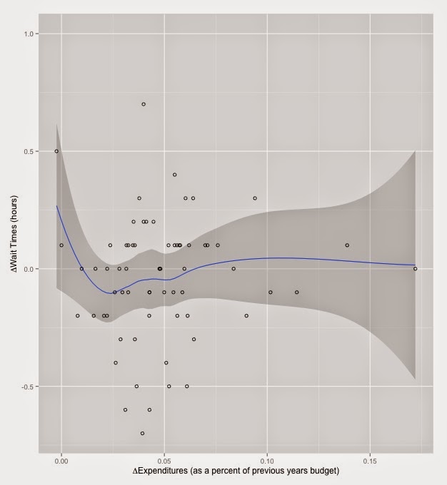
Now to make an argument that once the RHAs get this funding they don't reduce ER wait times with it. Below is a figure that graphs the change in expenditures versus the change in ER wait times. The relationship plotted is a LOESS regression (locally weighted scatterplot smoothing) and the dark grey area is the 95% confidence interval. Basically there is no relationship between changes in expenditures and changes in ER wait times. The exception is for a portion of the regression at about $30,000,000. I think this is likely due to chance rather than a real relationship.


But maybe this is the wrong relationship to be examining. This has no real regard for the size of the RHA and you would expect that very large RHAs would also have very large changes in funding simply because they are larger. An increase to the budget of Toronto's RHA is going to be larger than the increase to the budget of PEI's RHA. To try and control for this I've graphed the change in spending as a percent of the previous years budget (ie. (EXP_y1-EXP_y0)/EXP_y0). This will roughly remove overall size of the RHA (in expenditures) from being a confounder. Using this measure also shows little to no relationship between changes in expenditures and changes in wait times.


Maybe this is something that only applies in places where there are already high wait times. In RHAs that have high wait times do we see increases in funding translate into decreases in wait times? Using an arbitrary cut-off of RHAs that have wait times above 3.5 hours both fixed effects linear panel models and simple OLS models demonstrate no relationship between increases in funding and ER wait times in this subsample.

So it does seem that when an RHA has a longer wait time they get more funding. But when RHAs get more funding it doesn't seem like they use it to reduce ER wait times. Moreover, the places with high wait times that should be reducing wait times are not when they get more funding. This lends support to the RHAs don't care theory.

I doubt that this is something that would hold at any wait time level, especially very high ones. For example, the Grace hospital (in Winnipeg) has the longest wait times in the country at over 9 hours. Again, this doesn't count the time after seeing the doctor waiting in an ER. My guess is that this is a wait time that the Winnipeg RHA will not tolerate even if it means that they lose political pressure and associated funding bump. It does seem though that RHAs are willing to tolerate wait times of around three to five hours before emergency room patients will see an ER doctor.

The use of this measure by CIHI and the RHAs is also a textbook example of how to lie with statistics. Note that they do not use the total amount of time that a person waits in the emergency room. They use time to see a doctor. The real time that a person spends in the emergency room is, without a doubt, far longer than what is documented here. I suspect the reason why this benchmark was agreed upon was to artificially reduce the wait times reported.  This induces perverse incentives at the level of health care provider as pressure will be on doctors to reduce the time of first contact with a patient but not necessarily the overall wait time.

Finally, from a health systems perspective, if you buy this theory then the incentive is for RHAs to reduce the funding to ERs below an optimal level. They get more funding if they deliberately starve the emergency department. How should governments ameliorate this perverse incentive? One such strategy would be based on tying funding to actual future performance outcomes. If governments promised additional RHA funding bonuses based upon reductions in ER wait times this would provide the additional money that RHAs want if they actually get on top of the ER waiting problem. This would make it in an RHA's best interest to cut their ER wait times.


Saturday, 14 March 2015

How are you most likely to get your limbs lopped off?

Let me tell you a tale of two amputations. When I was on my anesthesia rotation I had the unfortunate experience of meeting a man, younger than me, who had been working with a piece of heavy machinery. He got too close to the intake and his arm was caught in the blades. It had been mangled into a pulp. We had been consulted about a week after this happened because he required some pain control before his third surgery. The surgeons had been slowly chopping off pieces in an attempt to preserve some of the limb but because it had been so badly damaged he didn't really have any function in whatever remained of the lump of meat that was his arm. I heard later that they had eventually taken the whole thing off.

On a separate rotation through an infectious disease clinic I had another amputation experience. There was an older lady from up north who had severely uncontrolled diabetes and had got an infection in her big toe. The attending doctor immediately recommended an amputation of that toe. Luckily, his friend, the vascular surgeon, was just across the hall running a vascular surgery clinic and so they decided it could all be done right there in the room under local anaesthetic. Snip snip - in 30 minutes I went from seeing a patient to seeing a toeless patient.

I've seen a couple of other amputations as well but these stick out because they are pretty typical examples of how you would lose a limb. Whenever anyone thinks of an amputation they usually think of the first guy: a mechanical accident affecting someone young. From my very brief medicine career, amputations seem to be much more like the second story here. Somebody has a longstanding condition that causes him or her so much pain or so much neurologic damage that it eventually needs the Marie Antoinette treatment. Nevertheless, for some reason, people think of amputations as events that occur among young, fit people in their prime in traumatic circumstances. So, what does the average person at risk for an amputation look like in Canada?

For all of this I use data from the Discharge Abstract Database, which documents all of the patients who enter and exit hospitals in Canada. This covers the time period from 2009 to 2012 and has information on their stay length, medical condition, and location. One caveat is that because of data sharing agreements, the public use datafile does not include any hospitals in Quebec or BC. It's also difficult to draw inferences about amputations in the territories because they don't do a lot of surgery and they'll often medevac patients who need intensive care to southern facilities. In addition, because it's the public use data file I don't really know what's been amputated, just that something has been amputated. 

So first some descriptives. There were at least 1,219 amputations in Canada over the 2009 to 2012 period. This is an underestimate as there is an additional category of diagnosis that I exclude because it also includes orthopaedic procedures to repair broken arms as well as arm amputations. The category is denoted "Resection/amputation/fixation of upper limb except shoulder/hand". It's likely this category is mostly broken bone repairs but it does also likely include some arm amputations, which are not counted in the 1,219. In terms of sex, males are much more likely to be the person having the amputation: over 63% of all patients getting amputations are men. In terms of the type of surgery performed, 63% of amputations were emergent or urgent whereas 36% were elective. There's a pretty even split of persons discharged home (50%) and to long-term care or rehab facilities (45%), but 4.5% died at some point during their stay. 

But going back to our examples, how do the differences in those two stories relate to amputation rate? First lets examine age.


This graph shows two peaks in amputation rates by age. One peak is at the age of our first example: younger people (basically teens). The second peak is in older people (60-64 year olds).  Ignore the peak in people who are 80 and older - it's an artefact from collapsing all people over that age into one category rather than evaluating 5 year tranches. 

Also in line with the two stories is the cause of the amputations. There are only two broad diagnoses classes that I can observe when it comes to amputation; they are diagnoses related to musculoskeletal issues and cardiovascular/vascular issues. Amputations as a result of musculoskeletal (MSK) injuries - most likely traumatic injuries - are fairly evenly distributed across the age spectrum. Amputations because of vascular and other blood supply related conditions are really, almost exclusively an older occurrence. So MSK injuries disproportionately cause more amputations among the young, whereas even though there are a lot of older patients who have MSK injuries, they are much more likely to suffer from blood supply related conditions.


So we have an idea about average age of amputation. The likelihood of getting one increases as you get older, but there's a peak in younger persons, probably due to trauma. You can think of young amputations as something caused by labour force participation, accidents and other random events like the young man in our story. Vascular amputations though are more likely related to lifestyle factors: eating, smoking, etc. (this is a little simplistic - amputations due to frostbite would also probably qualify as vascular and aging itself is associated with these issues even in people who are fairly healthy). With this basic idea in mind, we can make some inferences about the healthiness of populations at a provincial level as well as the exposure that they have to accidents in the labour force. Where are people unhealthy and where are people getting into accidents? 

With the reminder that I have no data on Quebec or BC, it seems like Nova Scotia is the place where you are most likely to get your limbs chopped off for whatever reason. This was surprising to me because all the surgeons I've ever talked to in Winnipeg have boasted about the ability of their service to cut off arms and legs because of how many amputations they see. Manitoba places a distant third after Nova Scotia and Newfoundland and Labrador. These three are followed by our prairie brethren in Saskatchewan. Ontario, New Brunswick, and Alberta all have the same approximate rate, and PEI rounds out the bottom of the group. I guess nobody loses arms in the potato fields.


The fact that two maritime provinces are tops in the amputation league table leads me to suspect that this has something to do with fishing but I don't know. Maybe that's just the stereotype I have of maritimers. If we look into the breakdown of MSK and vascular injuries though, this would also suggest that MSK related-accidents are driving amputations in Nova Scotia in particular.


If we make the assumption that MSK injuries are correlated to labour market accidents or trauma, it kind of makes sense that the top two provinces are Nova Scotia and Alberta. Nova Scotia has the fishery, but also, on a cursory glance at Wikipedia, a lot of mining and resource-sector jobs. Alberta has the tar sands. Both of these economies have a lot of hungry-for-appendages-type machinery. Here, Manitoba comes in third likely because of the farming sector.


In contrast though, Newfoundlanders seem to lose their legs to vascular disorders. If vascular injuries are correlated with lots of lifestyle choices that are bad for long-run health (smoking, eating McDonalds, no exercise) then, based on this, Newfoundland and Labrador is probably the unhealthiest place in Canada. Nova Scotia doesn't do much better on this measure though coming in a close second. Manitoba doesn't even make the top three, being beat out by Saskatchewan.

So the person who is most at risk of an amputation is a male in his 60s who is probably suffering from poor blood supply or diabetic infection to a limb because of poor lifestyle factors. He's probably from eastern Canada (at least on a population-adjusted basis), likely Newfoundland and Labrador.

With all of this in mind, why do people think of the young guy crushed in a thresher rather than the old lady with diabetes when they think about amputations? The latter seems much more typical of the amputations that occur in Canada. As a sort-of economist I'll throw out one possible reason: people value the former person's story more than the latter. They sympathize with somebody who has had to undergo a lot of trauma in a very short order. I would go so far as to suggest that some of this is even valuing a young limb more than an old limb. A young person who has a leg cut off has to go for the rest of his or her life without it, whereas an older person won't be using that leg for very much longer anyway. Charities definitely capitalize on this sentiment. It's never your granny hobbling around in a WarAmps commercial - it's always the cute kid with the prosthetic. Would you donate more if it was the other way around?

Is that right or is that ageism? I'm not sure. But I've got at least forty years to smoke and eat McDonalds before I need to make that decision.


Wednesday, 4 March 2015

How much more coffee did I drink on my internal medicine rotation?

Internal medicine is much like an abusive relationship. There's a lot of fear and anger and sleepless nights during the whole experience but after you leave them you always look back with a weird amount of positivity. 

For a lot of medical school, students are treated (with pretty good reason) like barely functioning, hung-over hooligans who shouldn't be given a bag of sand to look after much less a living patient. Not so on your third year internal medicine rotation. Your patients are your responsibility, and nobody second guesses your management plans except to tweak it or give suggestions. For myself, it was the first time I threw on the big boy stethoscope. You feel like a real doctor. Besides that you learn an incredible amount and you work with some of the smartest residents and attending doctors in medicine. This really makes all the difference in an intense situation like an internal medicine ward - I had three very intelligent and patient senior residents who taught me a lot. Same goes for my three attending physicians. 

On the other hand though, my internal medicine rotation was the most grinding, gruelling marathon in which I've ever participated. Looking back I think I easily worked 100+ hours per week. My day started at 645AM when I would come in to Health Sciences Centre in Winnipeg to see my patients, check labs, make a plan, etc. We would round on patients (walk around, say hello, examine them, make orders, call consultants) until about 1130 and then in the afternoon we would write notes, do procedures and get some teaching from the senior medical resident. Sign-out rounds (sitting down and talking about what happened during the day for each patient and talking about any patients coming to the ward that night) were at 5PM and then anything else that hadn't been accomplished would be completed after that. 

630PM days were pretty normal unless you were on call in which case, saddle up, because you're here for the next 14ish hours. One person from the team would always stay on the ward overnight and for me it was always a special experience. When on call at Health Sciences, your night consisted of making sure no one died, pronouncing people who died, admitting new patients to the ward, writing orders for patients who needed medication changes, getting called to an imminently dying patient and if you were lucky maybe an hour or two of sleep. You then got to go home after presenting your patients on rounds the next morning and slept for the entire day (your post-call day). Wash, rinse and repeat the next day. Call, for me, was about every four days (on average - an important distinction).

Because of this most of my classmates, and myself, look back at these six weeks with an almost Stockholm Syndrome-like reverence. It's the most immersive learning experience I have ever had (and an overall positive one) but because the above is pretty typical of internal medicine residencies, it doesn't have a reputation for being a job with a balanced lifestyle. I once had a senior internal doctor tell me verbatim "nobody gives a shit about how well-rounded their doctor is, so study more", which seems harsh but if I was sick and in the hospital I would want this guy looking after me, no questions. Internal medicine docs have a reputation for being exceptionally smart and being great problem solvers, but they don't have a lot of hobbies.

Now let me backtrack a bit to be clear for those without a medical background. Internal medicine doctors essentially run every major hospital in any city in Canada - they're experts in diagnosis and treatment of diseases. They don't do surgical stuff but if you get admitted to hospital for something like a heart attack you see a cardiologist who is an internal medicine doctor.  Other internal doctors include those who do infectious disease, lungs, kidneys etc. - these are all internal medicine sub-specialists. Consultants are extremely important in patient care but to be fair to the internal medicine people, rotations on sub-specialty consulting services are much less intense from a time-commitment standpoint than CTU.

In Winnipeg, on the ground care is delivered by general internal medicine doctors through a general medicine ward or clinical teaching unit (CTU - medicine loves abbreviations). Any specialty involvement is as a consultant to the CTU team, with some exceptions (cardiology for example has its own ward at one of the major hospitals in Winnipeg). Medical students in third year are embedded as part of a team that runs the CTU, which means that they take care of patients directly, and I was one of these medical students about 8 months ago. 

But back to the question that started this post. CTU is a long, grinding experience. As a guy who needs to have coffee to avoid drooling in front of people on a normal day, the 26 hours that I would sometimes go without sleep really upped the ante on my caffeine addiction. I don't think my experience was all that atypical either. I would often hear my other classmates commiserate about what cup they were on that day when we all met for some group teaching session on our weekly half day off. So how bad (or good?) did my coffee drinking get during my CTU rotation?

To answer this question, I had to do the one thing every medical student hates to do more than anything else. I had to look at my Royal Bank of Canada credit card statement. The great thing about banking with RBC is that along with monstrous, soul-crushing debt, it provides me the ability to download expenditure data into a CSV file through my online banking. They're also kind enough to mark all expenditures on the statements as negative just to remind you that you owe them this money. A $2.00 expenditure is not just marked as $2.00, but as -$2.00.

Because I never had any time to sleep, I definitely didn't have the time to go get cash from an ATM and all of my coffees were bought via credit or debit card. From this I can pick out all the dates that I went to the Starbucks or Tim Hortons or Subway or the hospital cafeteria in a four-month period around the time I was on  the CTU at Health Sciences. Because I also know how much I spent, I can also tell about what size the coffee was. I have converted all of this into a rough estimate of the  daily caffeine content that I purchased using nutritional information from menus on company websites. I also had to make some guesses about how much coffee I purchased because of some bills that included snacks or other purchases that didn't exactly line up to an amount that would direct me to a coffee size. For these instances I've tried to give a conservative estimate of the amount of caffeine I consumed. 

The important thing in posing this question though, is how my coffee intake changed with regard to a comparator. I can easily tell you what my coffee intake was over my time on CTU, but if I was already drinking the same amount before the rotation, it doesn't really demonstrate anything about the intensity of CTU. To use some lingo I picked up in medical school, my "treatment" period then is my time on CTU and what a treatment it was. My "control" period is just before and just after my CTU rotation. In total this comprises the period of June until the end of September.

To give some context, the three weeks prior to CTU I did my rotation through Children's Hospital in Winnipeg on one of the paediatrics wards, which in itself was a whole bag of laughs. But this was at least similar to the ward work at Health Sciences except with less call. The period after CTU I went on vacation (thanks for taking me Mom!) for two weeks and then did four weeks of emergency medicine at a community hospital in Winnipeg. The emergency medicine schedule is usually an 8 or 9 hour shift and then you're done - any patients still around you pass on to the next ER doctor. While they both have their own idiosyncrasies, for the purposes of this exercise we'll call them typical of my coffee routine during medical school outside of CTU. 

So lots of writing but lets latte the stats do the talking. During the four month period I bought coffee 84 times. Of these, 49 purchases were during the CTU or treatment period whereas 35 were in the control period. While only comprising 6 of the 16 weeks in the time period my CTU rotation was responsible for 58% of the total coffee purchases in this timeframe. Comparing the percentage of all of my purchases (coffee or otherwise) in the treatment period shows a similar effect that CTU had on my life. Coffee comprised 66% of all transactions I made during this treatment period. In contrast coffee comprised 35% of all of my purchases during the control period. All very suggestive about CTU's effect.

In terms of coffee loyalty, this data reveals me as a true Starbucks man. Over the whole period, the vast, vast majority of coffee I bought was from Starbucks. Over 73% of my total coffee purchases were at Starbucks, with Subway coming in a distant second at 10.7%, and really that's only because I bought a sandwich at the same time and was too lazy to make a separate trip to Starbucks. For those not in the know, Guildy's and Pedway (now defunct) are/were two cafeteria-style restaurants at Health Sciences Centre.

If we confine examination to the treatment period on CTU, Starbucks purchases rise to over 95% of my total coffee purchases. This sharp increase was because all of these other coffee places couldn't really compete with Starbucks for scheduling reasons. Starbucks was open all night and everyone else wasn't, and that's when I got the majority of my coffee on CTU. I would've drank week-old coffee grounds strained through a worn hairnet on some of those nights so how much my slavish loyalty says about Starbucks is debatable. I also have no idea how doctors function on CTUs without a 24-hour coffee shop nearby.


Slavish devotion to Starbucks in one picture?

Moving onto a more in-depth analysis of how much coffee I consumed above my baseline level because of CTU, below is the time-series of total coffee consumption during the four months. There are two figures here, and the second is more confusing than the first but they're essentially the same graph. The first figure is a time series of my total caffeine consumption purchased during the four-month period. This also has a gap when I went on vacation (and didn't pay for anything - thanks again Mom!).

The second figure is a time series of each rotation with the origin being the initial day I was on the rotation. Day 0 is the first day I began each rotation and for example, day 40 is the last day I spent on CTU (a total of six weeks with some gaps for weekends). This allows comparisons of how my caffeine intake changed as each rotation progressed.

Time series of caffeine intake

Caffeine intake by rotation where day 0 is the first day on rotation


Now what can we say about each of the control periods on emergency medicine and paediatrics? Statistically they are exactly the same. I drank an average of 325mg of purchased caffeine each day while I was on paediatrics wards. After CTU, on emergency medicine I consumed about 300mg of caffeine per day.

Where it gets interesting is during the treatment period. What's particularly interesting to me about these two graphs is that you can literally pick out the days that I was on call for the CTU. The spikes in use of caffeine correspond to the evenings I was on call. The saw-tooth pattern is a result of getting a lot of coffee the night I was on call and then a couple on the morning that I was post call. I would go for a coffee at about 0300 or 0400 and then again just before rounds at 0800. After this I would go home, have greasy post-call breakfast, and sleep. This would mean that on these post-call days I would have maybe two coffees to try and get myself through rounds in the morning.

The trend in caffeine intake also is indicative of how sleep-deprived I was during my CTU rotation. During my first two or three weeks I was probably on call every two to three days, which made for a giant, increasing sleep deficit. The escalating caffeine doses during these first three weeks demonstrates this. Notably, neither my paediatrics wards or emergency medicine rotation display similar behaviour. Then in week three or four of CTU I had a glorious period when I didn't have any call. I caught up on sleep and reduced my coffee intake significantly. In the final two weeks, I had significantly less coffee intake except for my final day when I bought a giant group-sized Starbucks coffee lug to share with the nursing and ward staff as a thank-you. I drank about 5 cups of coffee of this mostly because I was post-call on my last day before vacation (thanks Mom!) and was trying to ride the euphoria.

Explaining this relative decrease in caffeine consumption during weeks 5 and 6 may be related to how well CTU in Winnipeg teaches you to do an internal medicine history and physical. If I remember correctly, I managed to get more sleep during this period because I was able to recognize what I was looking for with the brief information I was given as the patient was transferred to the ward. This is graphical evidence, in coffee form, of exactly what internal medicine docs want medical students to get out of a CTU rotation. They want to teach you to be thorough but efficient when you deal with complex patients. You pick this up after a couple weeks of the CTU routine.

Overall, this analysis would suggest that I consumed 678mg of caffeine per day on my CTU rotation. This is significantly above the control periods that I discussed earlier. The standard deviation of my caffeine consumption went up significantly as well, suggesting that not only did I increase my caffeine use, but CTU also caused my intake to become much more spread out. On days when I consumed purchased caffeine I consumed a lot, but on days when I didn't, I consumed way less caffeine. During my CTU I approximately doubled my daily caffeine intake from about 300mg to 678mg of caffeine. A Starbucks "Grande" coffee has approximately 330mg of caffeine in it, so I was taking in an additional one of these each day because of CTU. 

Its important to remember though that the total caffeine intake on CTU that's shown here is likely an underestimate of my total intake. It doesn't take into account any times that I brought in a travel mug and had more coffee than the normal "Grande" that I usually purchased. In a pathetic attempt to limit how much coffee I was consuming at one point I consciously tried to buy Starbucks Refreshers to avoid coffee. These have some caffeine that is not accounted for here. In addition it must be noted this does not include any coffee I brought from home and I did this a lot when I was on CTU. I never thought I'd be desperate enough to drink powdered coffee packaged in Africa, but then I never had been on a CTU before this year.

The perceptive among my three readers will also note another fact about these time-series. This is essentially a graph of my 2014 summer slipping away in cups of coffee. I began paediatrics wards on June 1st and ended internal medicine wards on August 1st.

I often feel a twinge of regret looking back on a summer that I spent indoors on hospital wards but, baby, if you just take me back, I'll forget everything internal medicine.